soundcheck:
UX/UI Ecosystem
Challenge:
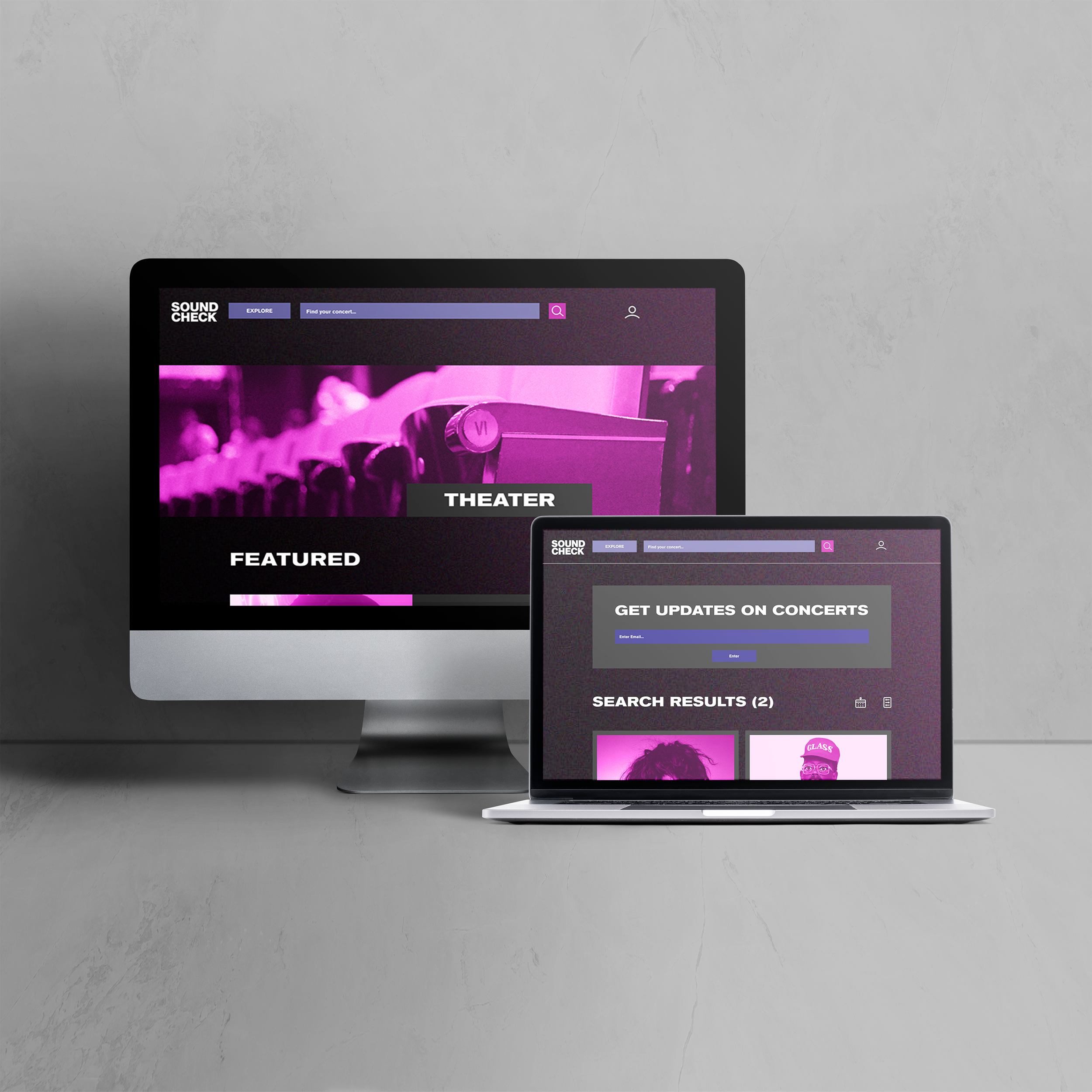
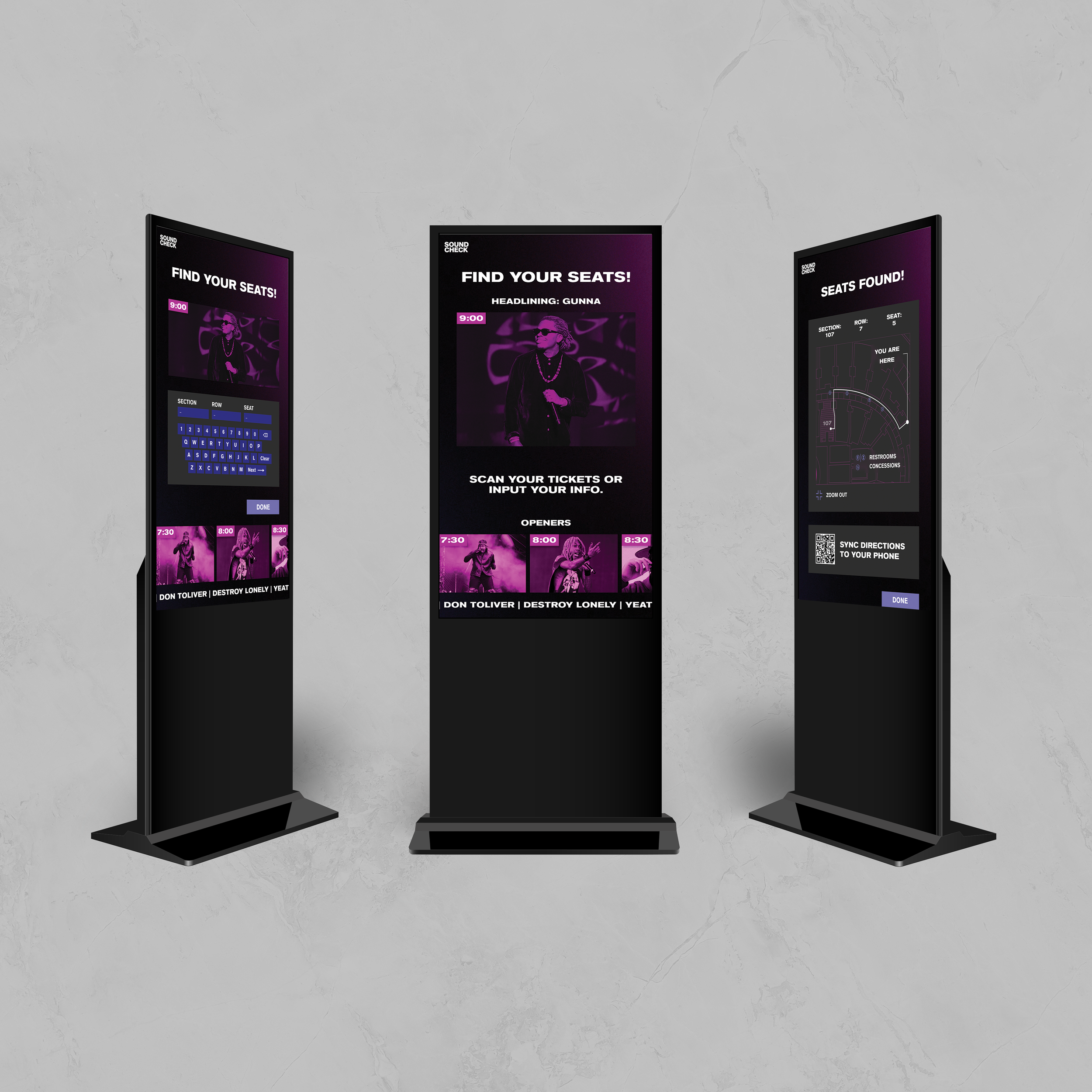
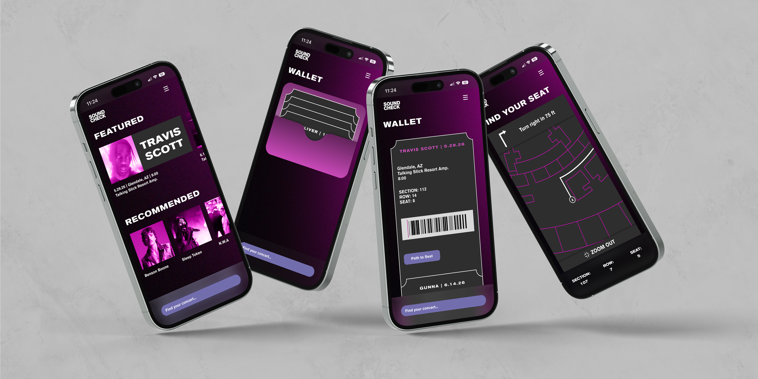
Transitioning Soundcheck from a creative concept into a scalable Design System, I collaborated on a standardized Team Library for a desktop ticketing site before independently scaling these foundational styles to a mobile app and an interactive wayfinding kiosk.
Research:
To establish a premium brand identity and professional user journey, we conducted a competitive audit alongside visual research into high-energy live music environments, resulting in a high-contrast palette and a seamless architecture for the platform’s critical interior pages.
Multi-platform UX/UI focused on streamlining the concert-going experience, from a centralized ticketing marketplace to an interactive on-site wayfinding kiosk.
Solution:
Collaborating with a four-person team to architect the Soundcheck desktop platform, I independently scaled the resulting design system into a mobile-first interface and an interactive wayfinding kiosk to ensure brand consistency and professional functionality across diverse digital and physical environments.