prevail jerky:
Package redesign
A strategic packaging redesign focused on aligning visual identity with brand values and target audience expectations
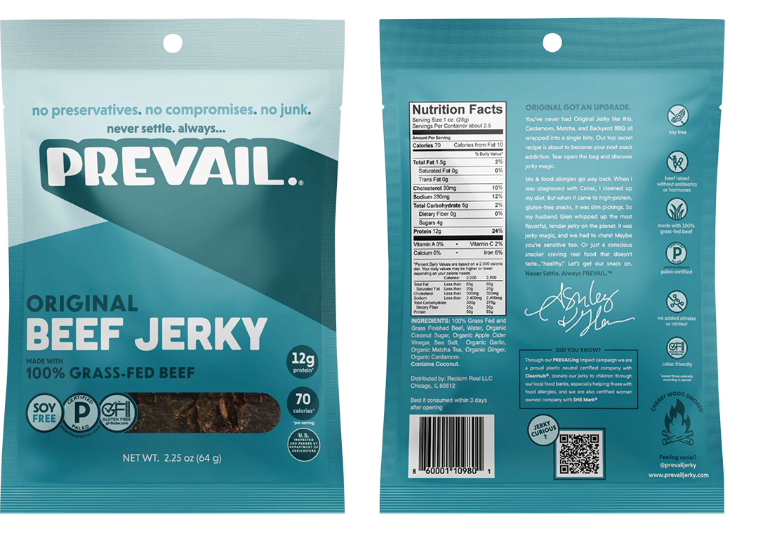
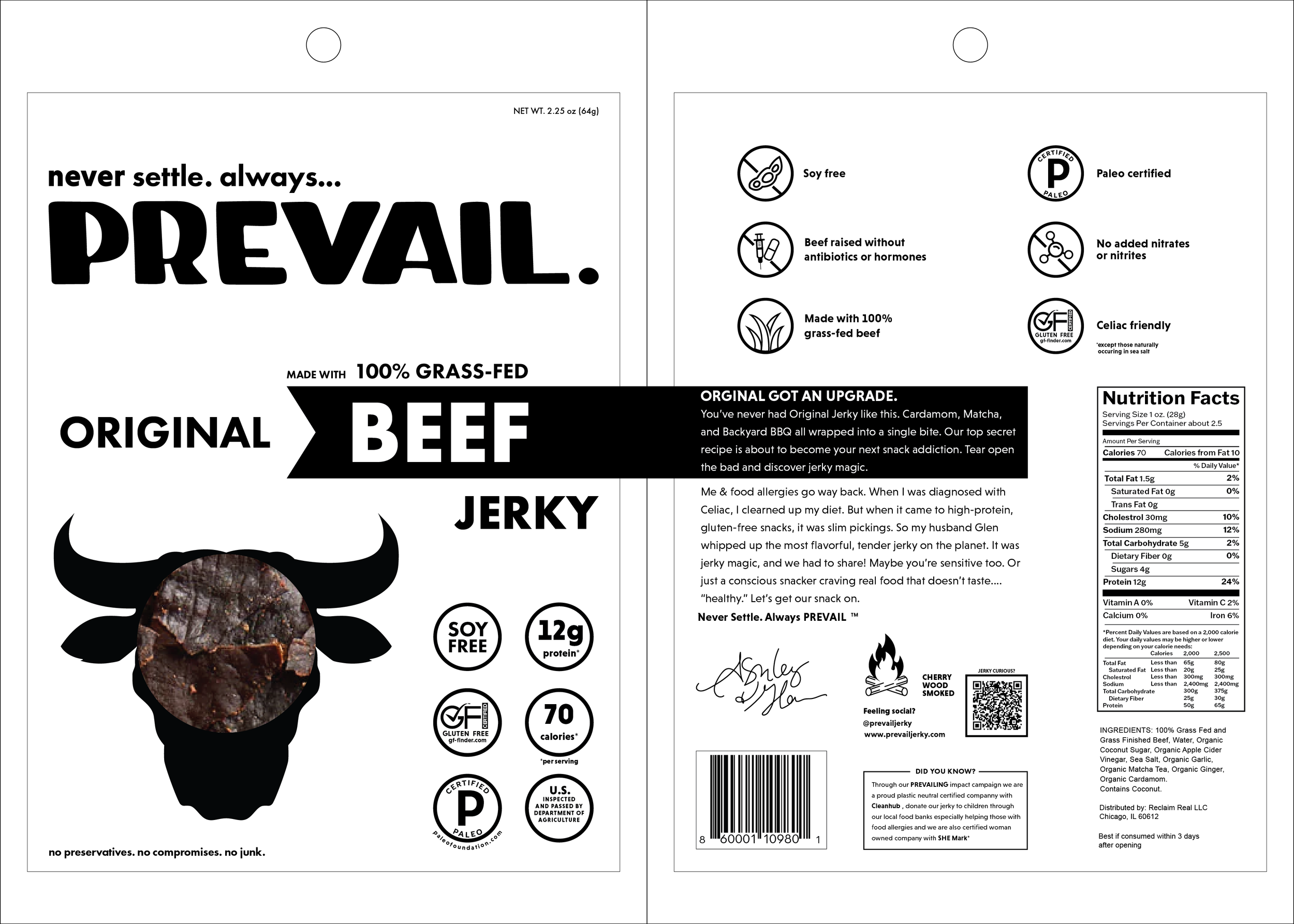
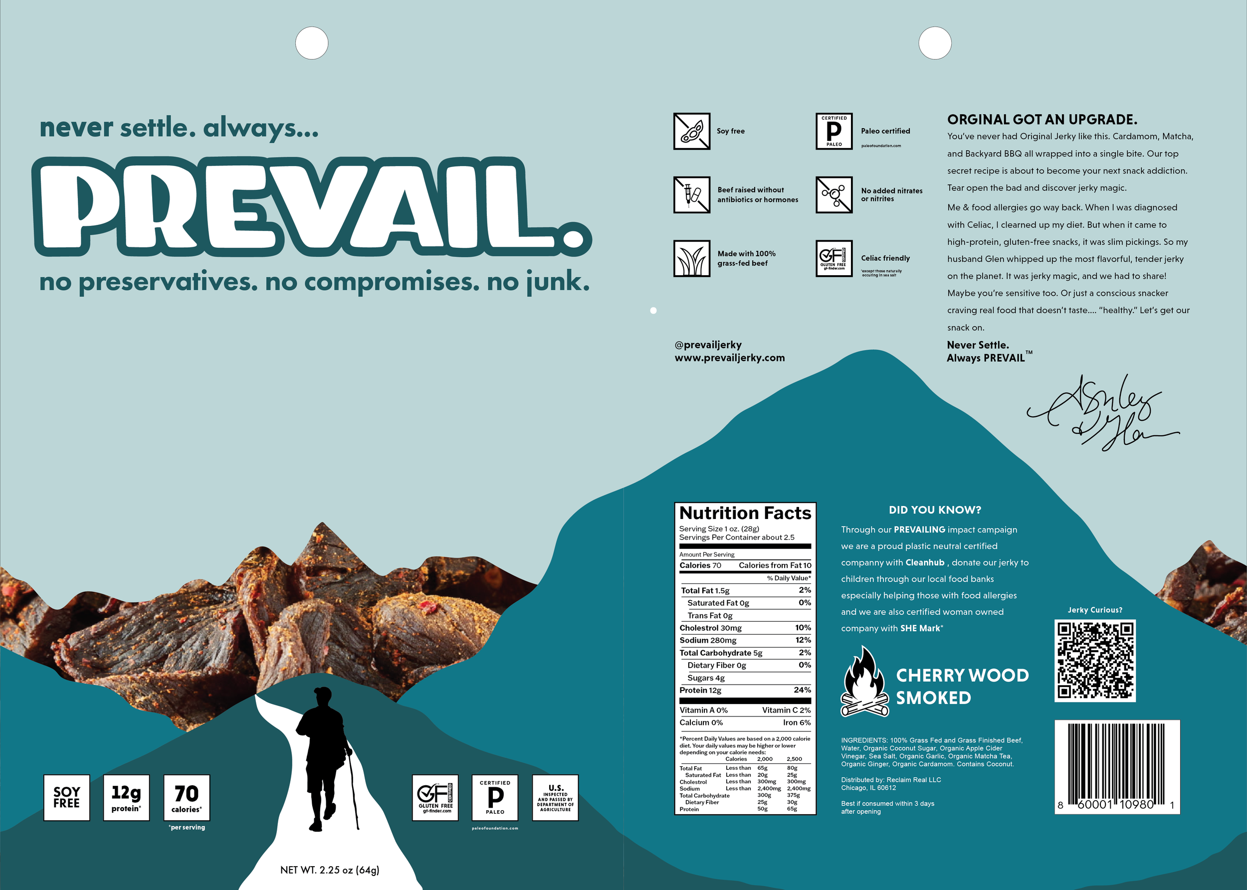
Original Packaging
Challenge:
The existing packaging lacks the necessary visual cues to signify its contents. By failing to reflect the nature of the product, the design creates a barrier to consumer understanding.
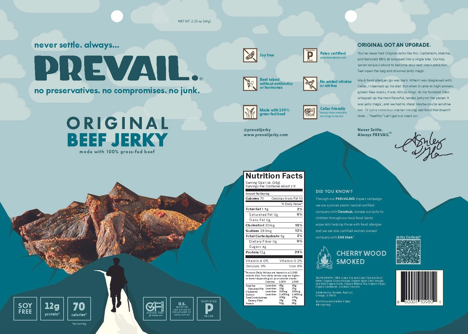
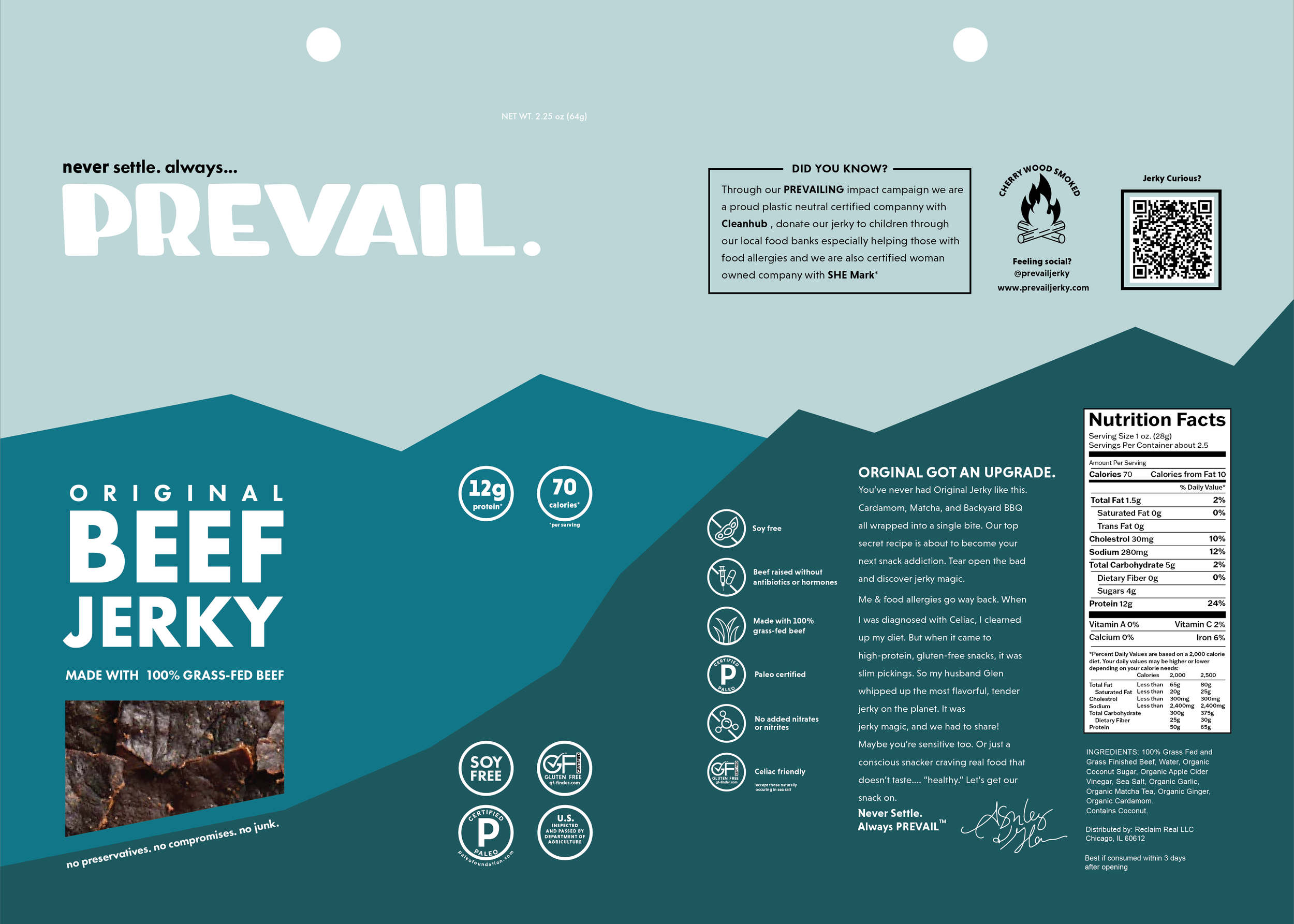
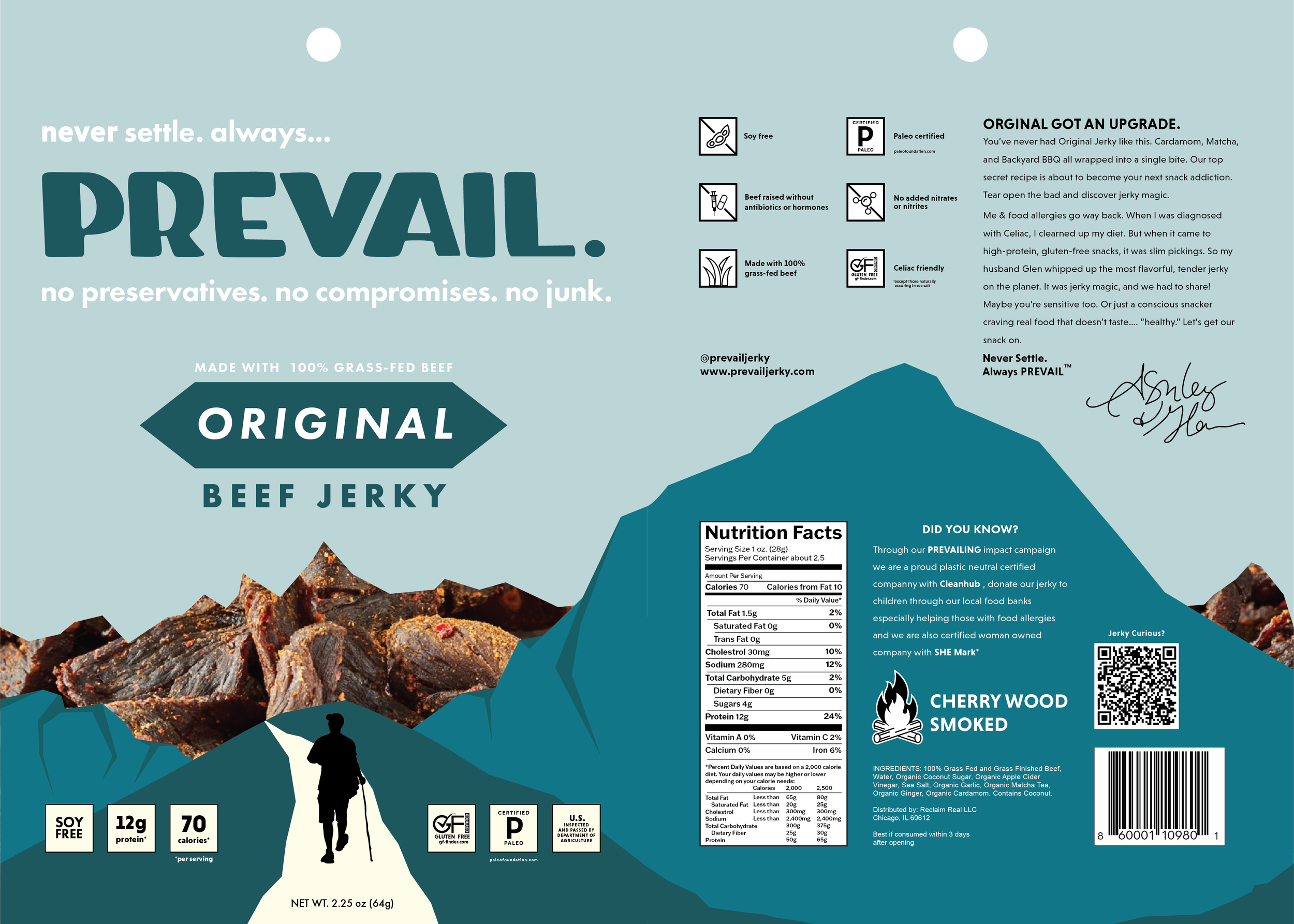
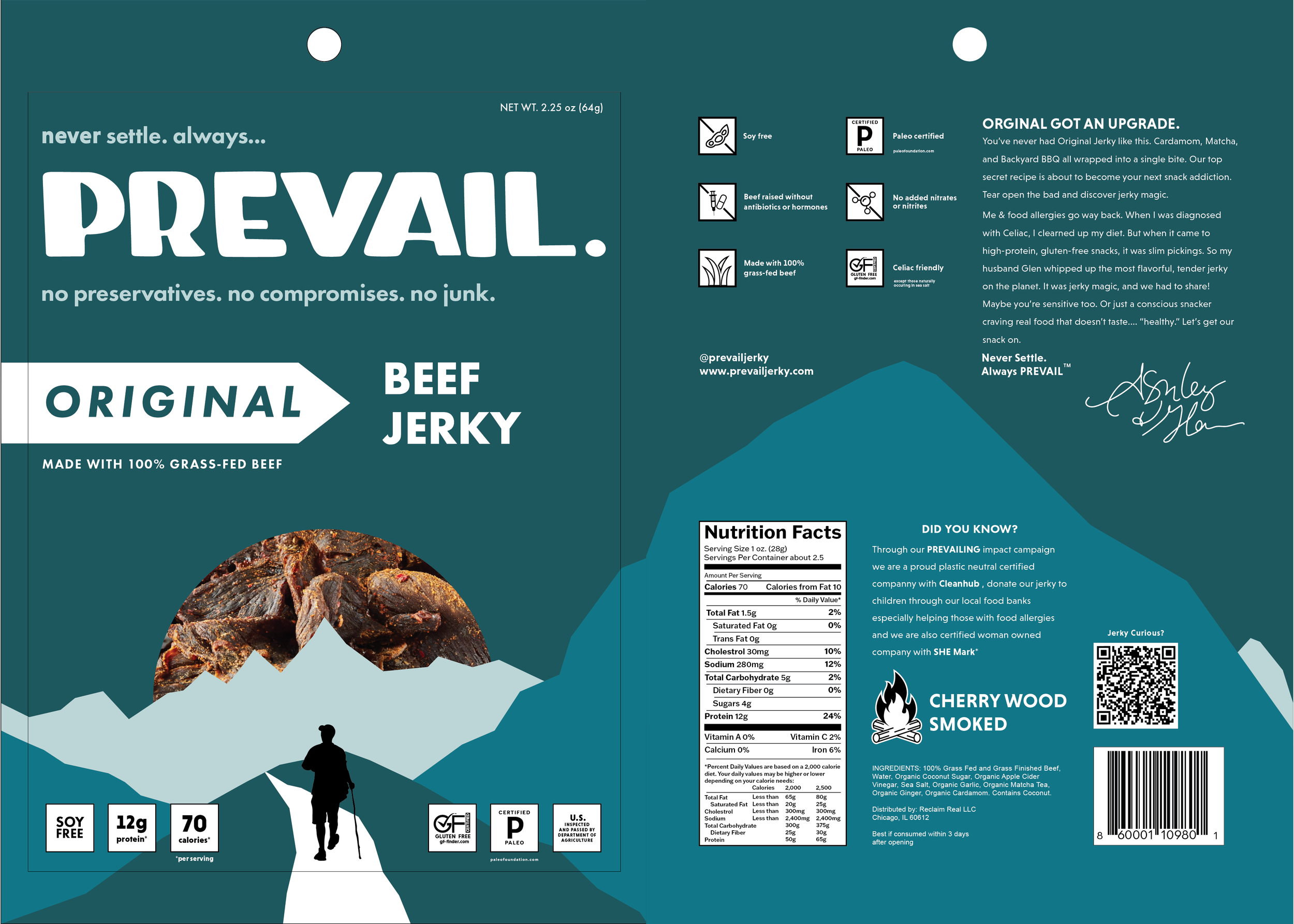
Proposed Redesign
Solution:
Bridging the gap between the brand and its target demographic, the redesigned packaging introduces an active, outdoor-focused narrative through an illustrative mountain-themed product window that utilizes a monochromatic palette and flavor-specific accents for easy product differentiation.
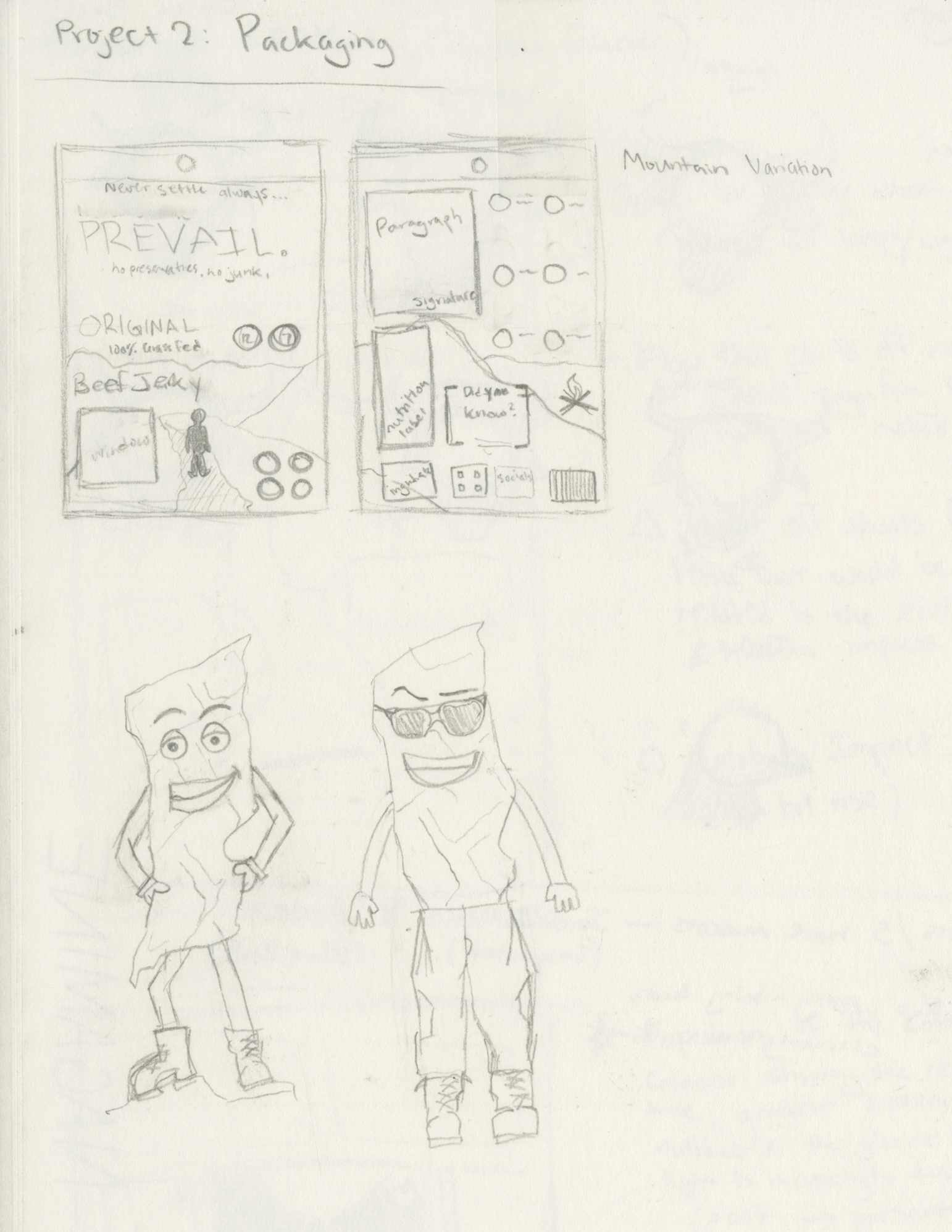
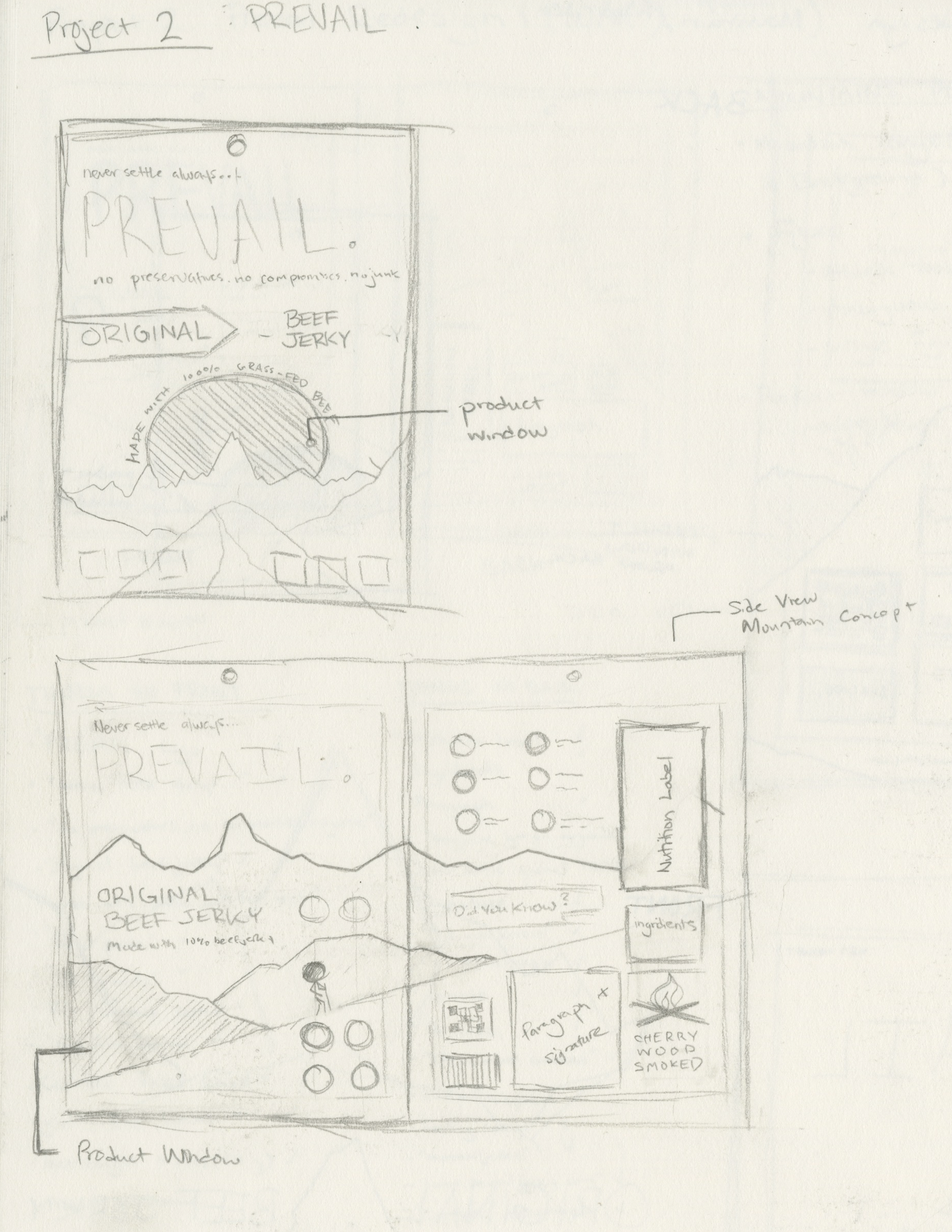
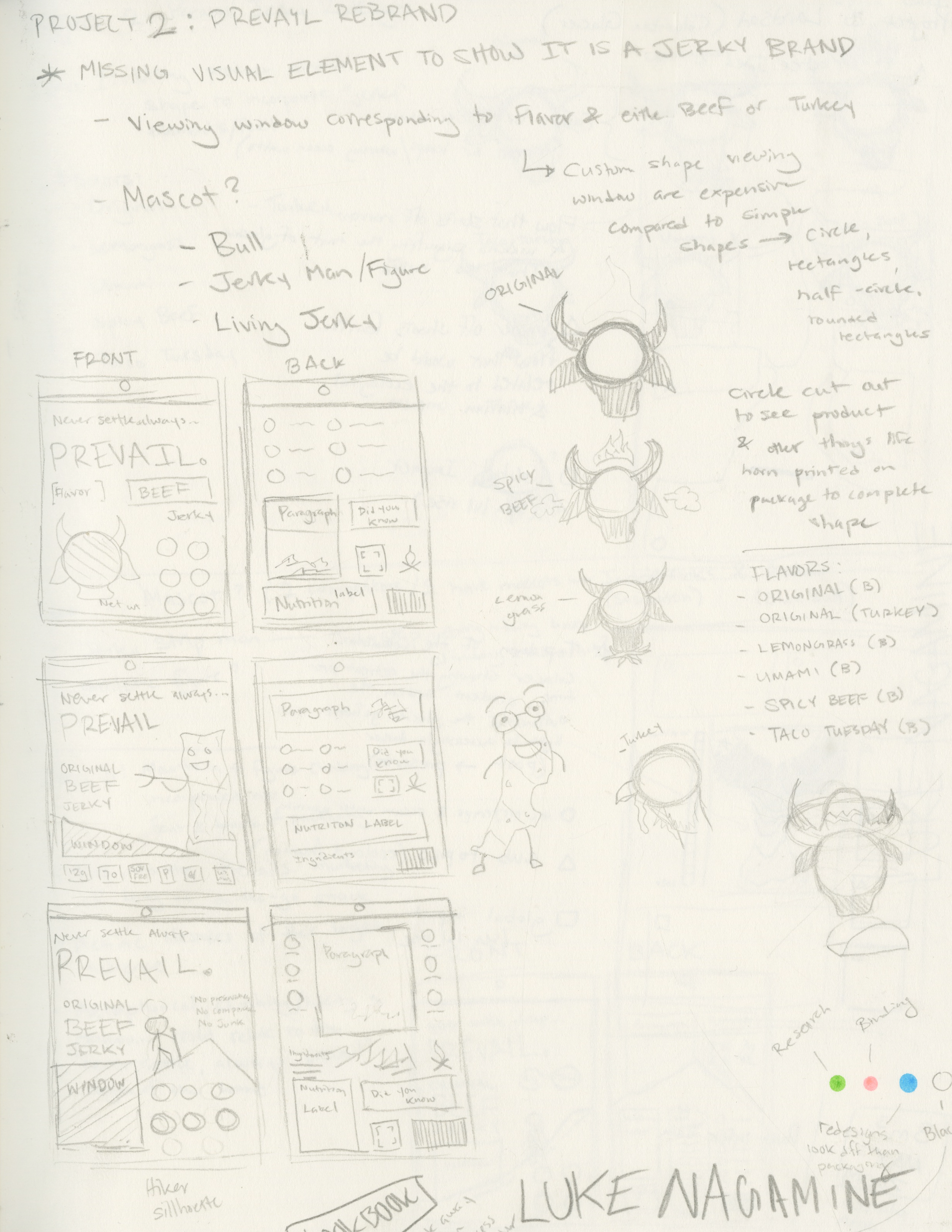
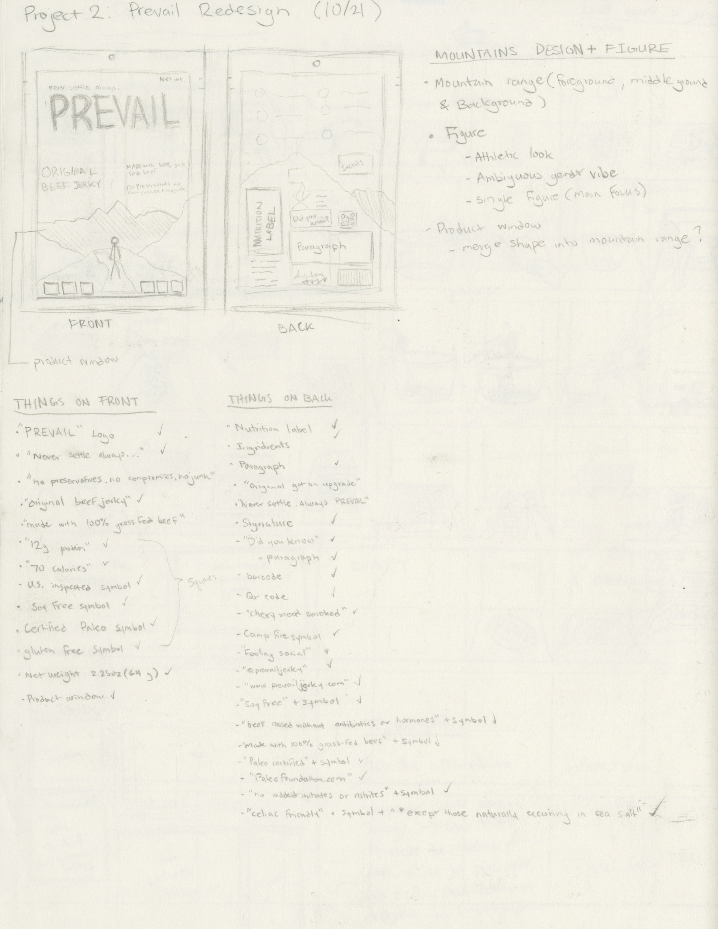
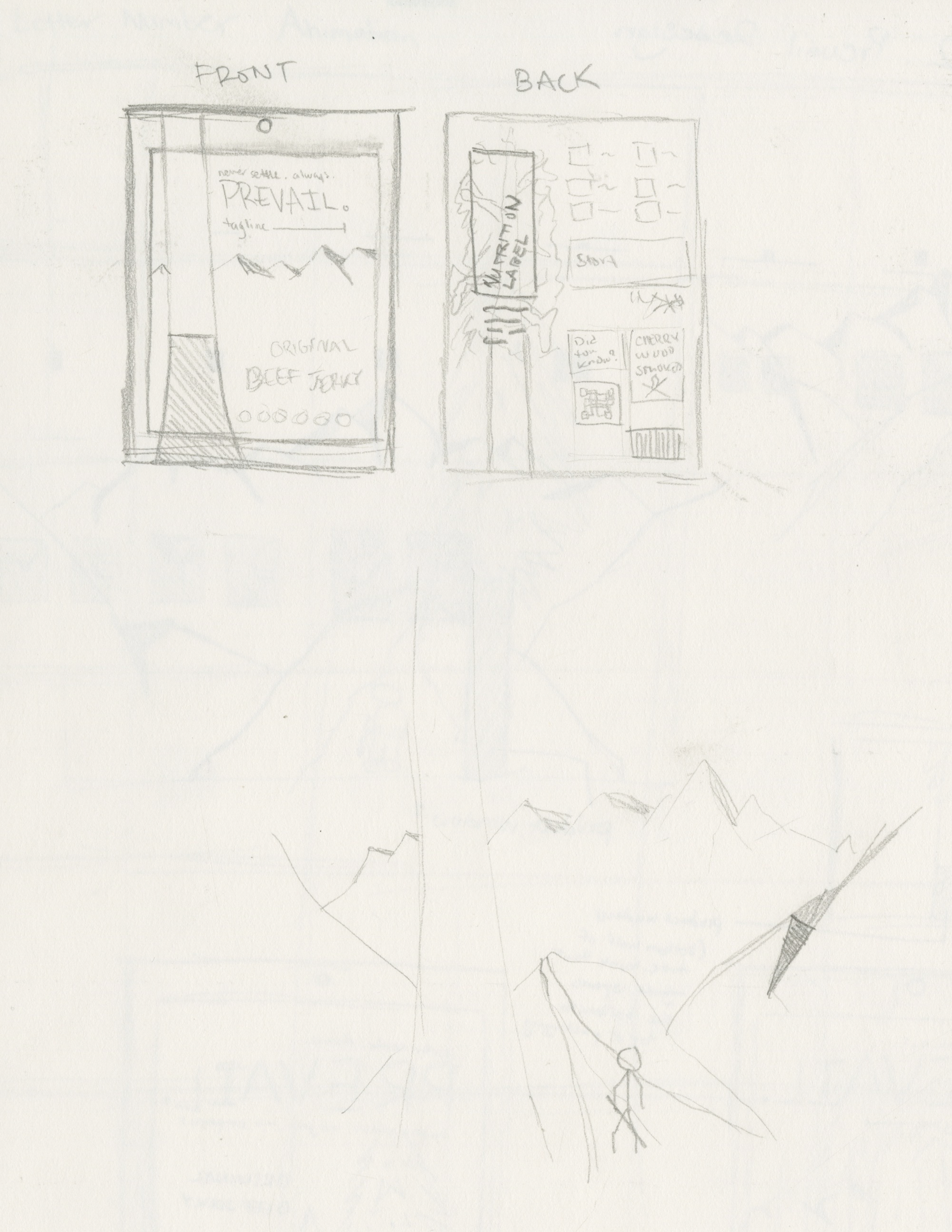
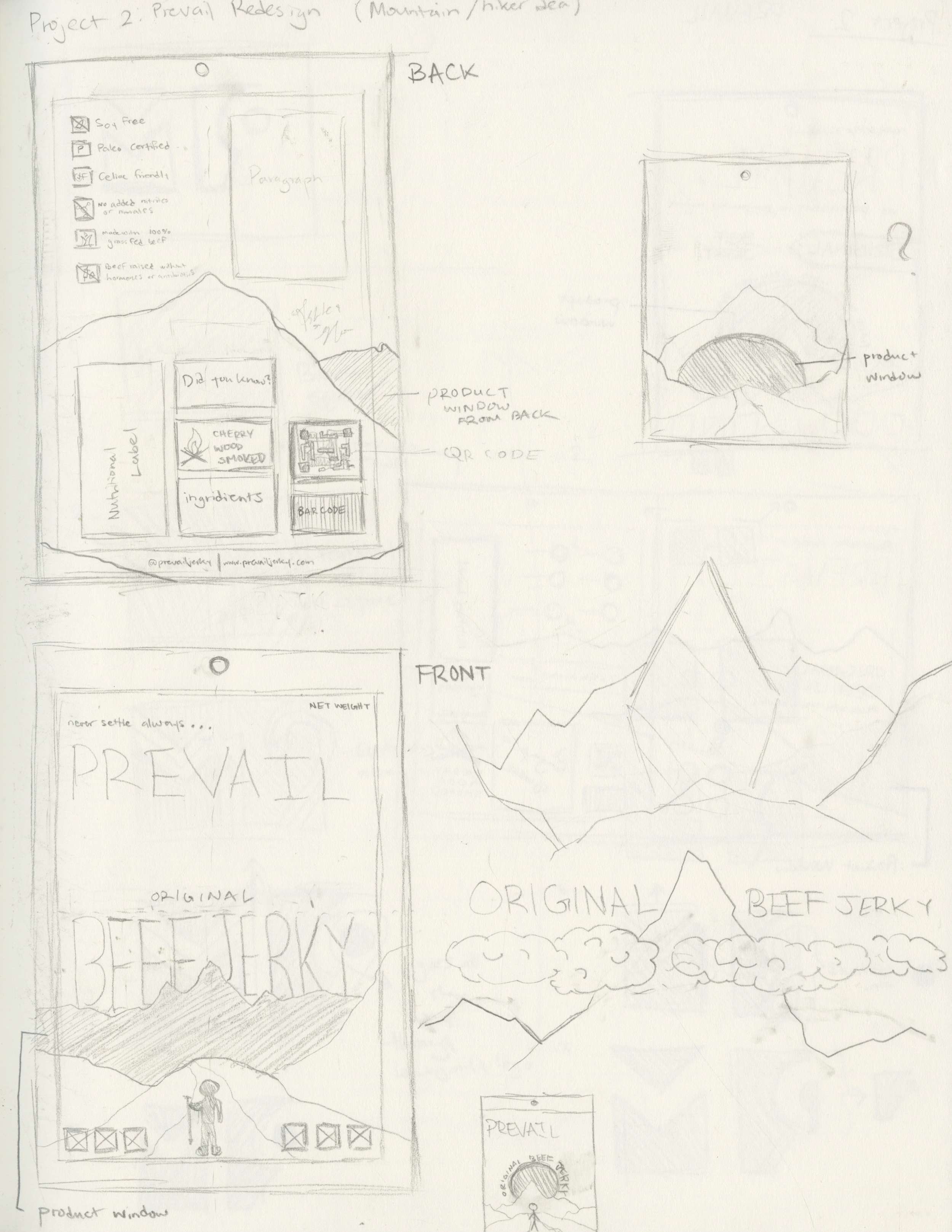
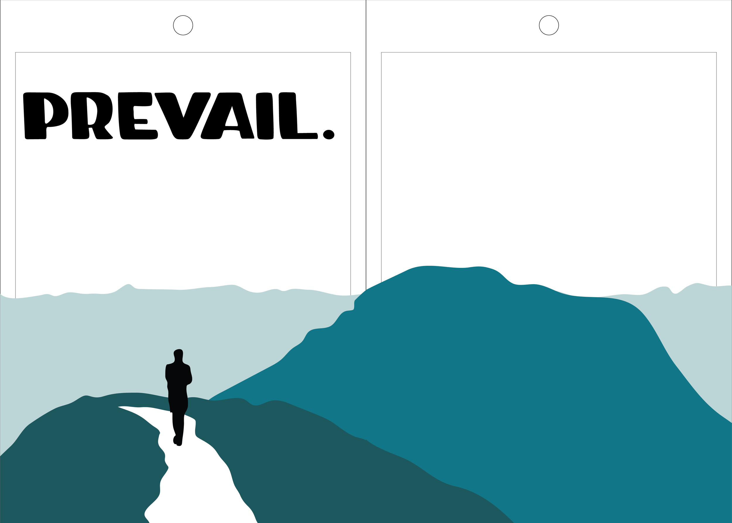
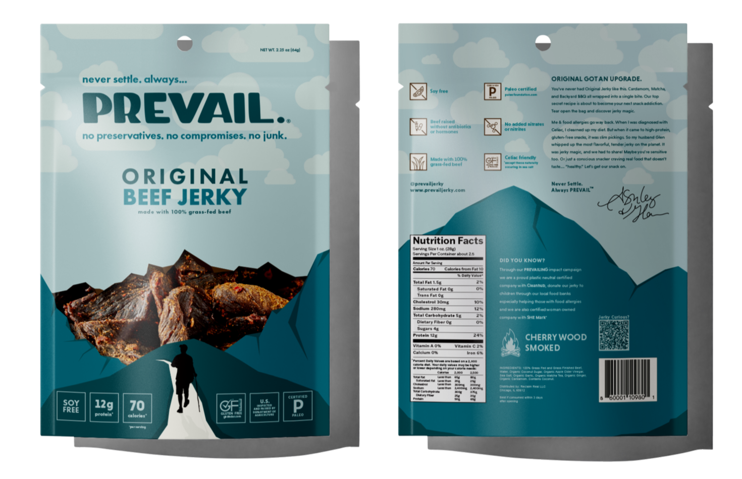
Sketches

Vectorized
Research:
After conducting a comprehensive competitive audit of five industry rivals, I executed a strategic redesign of Prevail Jerky’s packaging to strengthen category recognition and align the visual identity with key demographic benchmarks.