novem motors:
Brand identity
Challenge:
Engineer a distinctive brand architecture starting from a restricted alphanumeric constraint
Research:
After conducting a cross-industry audit of the media, interior design, and luxury automotive sectors, I strategically positioned ‘Novem Motors’ within the premium performance market by aligning its sharp geometric language and high-contrast palette with established industry standards.
Developing a comprehensive visual identity system, translating a letter number combination into a cohesive brand experience across digital and physical touchpoints
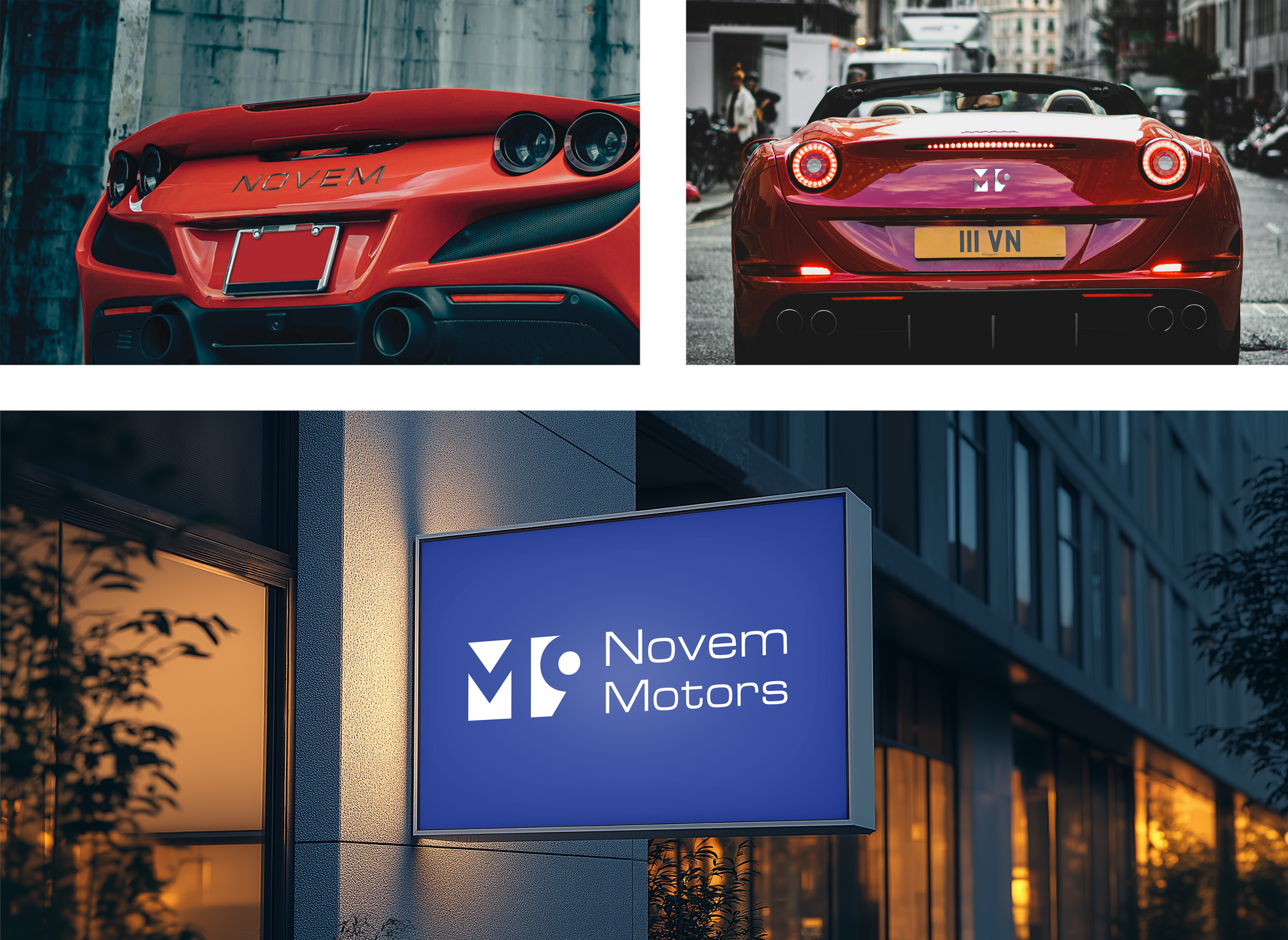
Solution:
By harmonizing the 'M' and '9' through parallel geometry and shared vertical axes, this unified mark achieves a state of formal equilibrium and industrial stability that ensures legibility across digital interfaces and physical vehicle badging.