Columbia glacier: Data Visualization
Challenge:
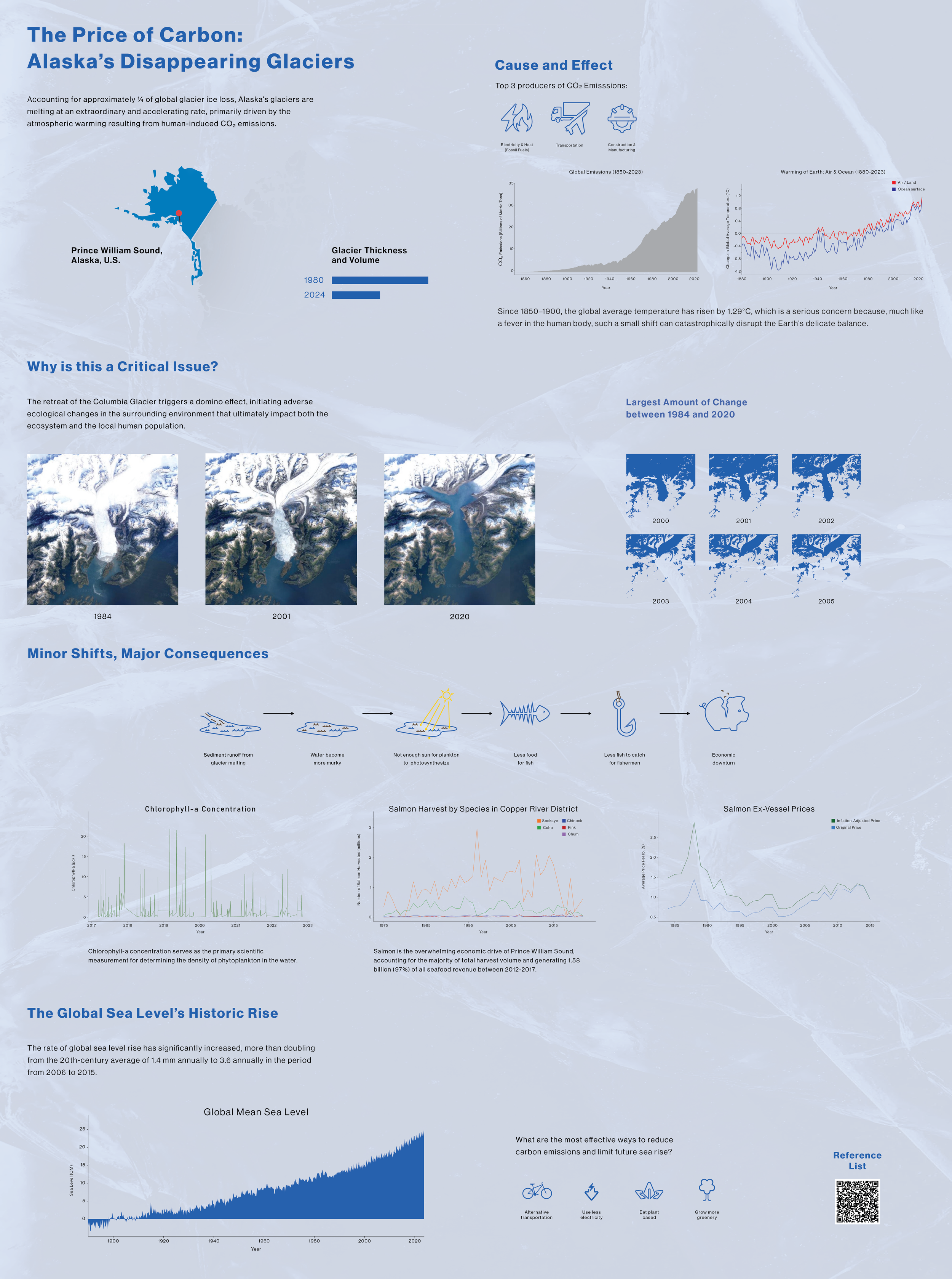
Transform complex climate datasets into a unified visual narrative. I was tasked with correlating the Columbia Glacier’s recession with global sea-level rise, ensuring the final information architecture was driven by the quantitative data rather than traditional grid constraints.
Research:
By developing a hierarchical conceptual map to establish causality between man-made emissions and the recession of the Columbia Glacier, I synthesized NASA Landsat imagery and climate data to identify the interconnected socio-ecological impacts of glacial melt.
Translating longitudinal satellite data into a multi-layered visual narrative that communicates the environmental impact of glacial recession over several decades
Solution:
This comprehensive informational system translates raw climate data into a structured visual narrative by mapping vectorized Landsat imagery and quantitative datasets onto a large-format poster that utilizes a rigorous visual hierarchy to guide viewers from man-made catalysts to their eventual ecological consequences.