Calendar: Data
Visualization
Challenge:
Visualize a shifting dataset over a three-month period using only typographic elements—strictly avoiding illustration. The objective was to communicate a complex idea through the systematic alteration of numbers, ensuring the concept was legible through form alone
Research:
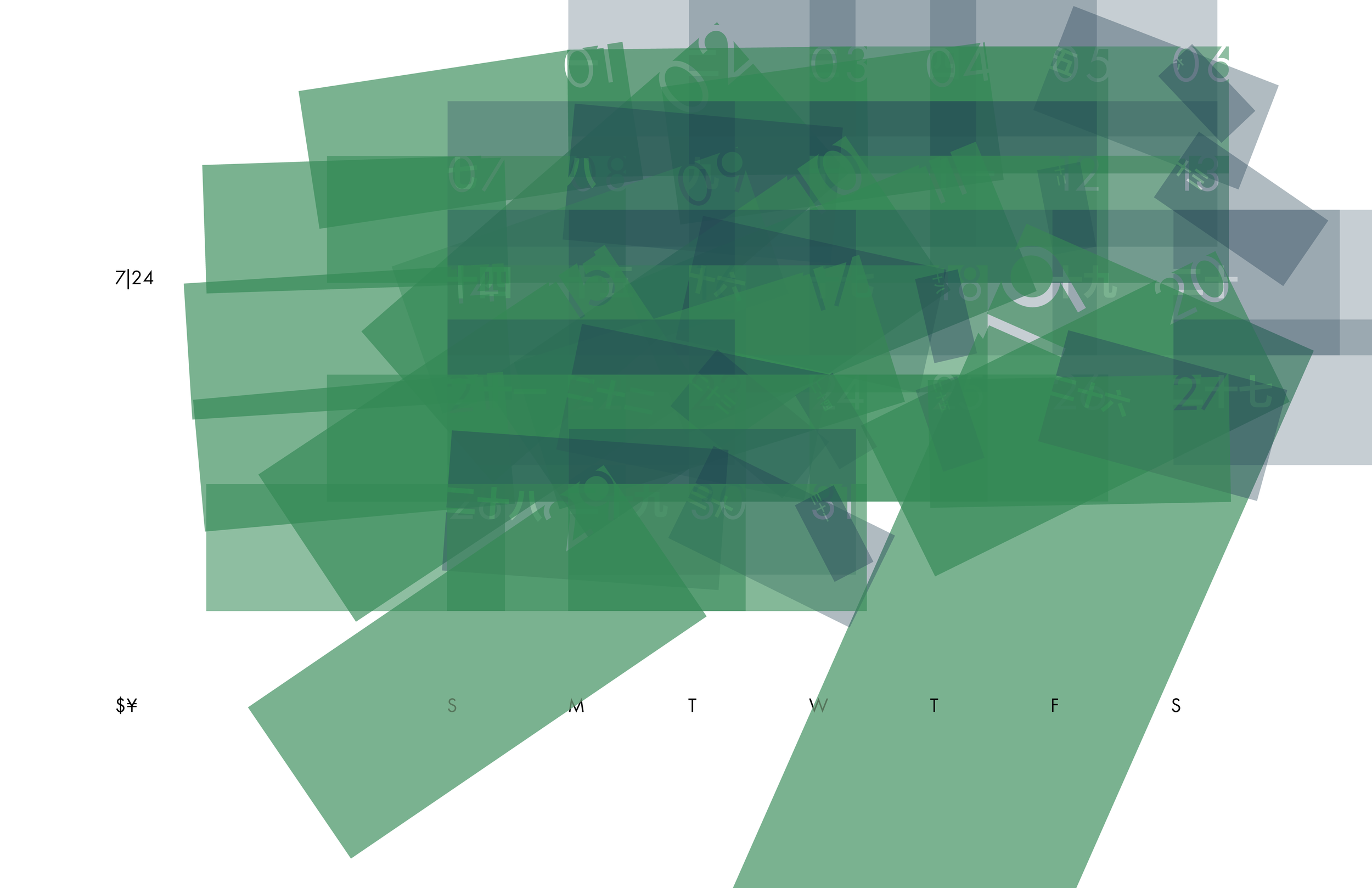
I conducted a comprehensive historical analysis of USD to JPY exchange rates, identifying a critical three-month window (June–August) characterized by peak market volatility. By developing a granular dataset of daily fluctuations, I cross-referenced value shifts to establish a precise mathematical foundation for the project. This rigorous data mapping ensured that every typographic alteration in the calendar was a direct, proportional reflection of real-world economic instability.
Solution:
I developed a dual-unit typographic system where currency units were represented by color-coded geometric forms. By plotting the June–August dataset, I translated fiscal movement into formal transformations. The relationship between the two currencies was expressed through a contrast in scale: the USD unit expanded against a static JPY unit during periods of Yen appreciation, while the JPY unit physically shrunk during depreciation. By syncing the angular orientation of these forms to the slope of the exchange rate, the calendar transformed from a static grid into a dynamic visualization of market momentum
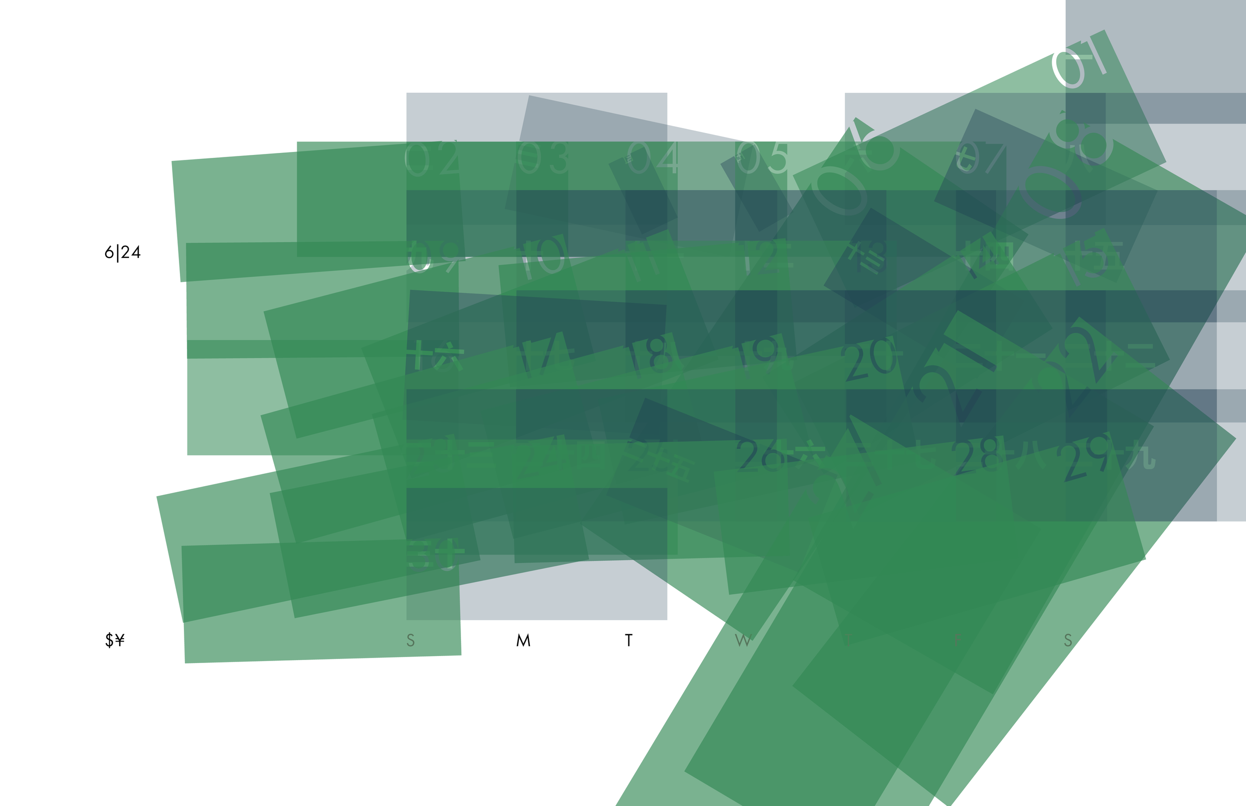
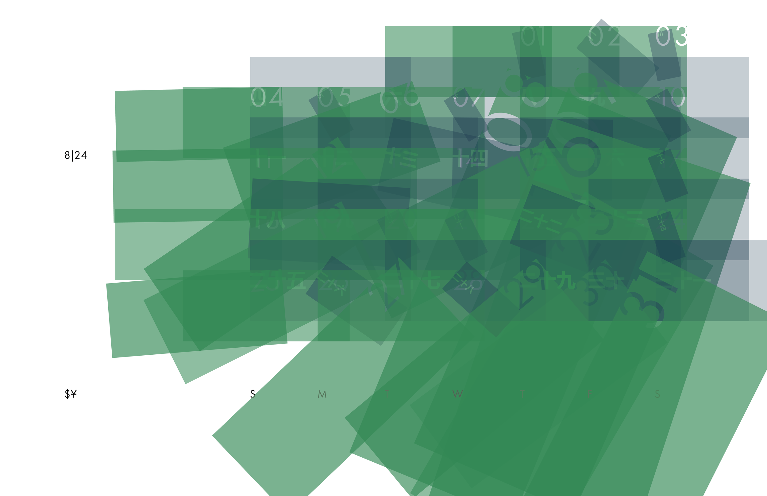
Typographic data visualization of the fluctuation of USD to JPY exchange rate during a 3-month period in 2024 within a calendar